Redrawing The Signal
Why PingRoom sharpened its red, rebuilt its app icons as adaptive systems, and gave PingRoom Agents a mark of its own.

The old PingRoom identity got us here. It was bright, direct, and easy to spot. But as PingRoom grew from one mobile app into a product that also lives on the web, Apple Watch, widgets, admin tools, agent surfaces, and social cards, the identity started behaving like a collection of exports instead of one system.
This rebrand fixes that.
We did not set out to make PingRoom unfamiliar. We wanted to make the signal more precise: a sharper red, a stronger primary mark, a related identity for PingRoom Agents, and source files that can adapt without drifting apart.
Why We Changed It
The product now has two connected roles.
PingRoom is the human signal: one tap, everyone knows. PingRoom Agents is where automated systems ask, hand off, and wait for human judgment. They belong to the same family, but they should not look interchangeable on a home screen.
The old asset setup also made consistency harder than it needed to be. A change could mean updating a light PNG, a dark PNG, a tinted PNG, Android foreground and monochrome layers, favicons, web manifests, social images, and every place an SVG carried the brand color. Any missed export became a slightly different PingRoom.
The identity needed to express the product more clearly and ship like software.
A Red With More Signal
We moved from the softer coral red we had been using to Signal Red, #E33122.
It is a small numerical change with a noticeable effect. The new red is cleaner, warmer, and more decisive against PingRoom's black and charcoal surfaces. It holds up at tiny favicon sizes, feels less washed out in glow, and gives the white mark better contrast inside the app icon.
The important part was not picking a new hex value. It was making it canonical. Theme tokens, SVG artwork, Android assets, web icons, social cards, and admin surfaces now point back to the same decision.
From Three PNGs To One Adaptive Icon
Our previous iOS setup treated light, dark, and tinted icons as three separate bitmap exports: icon.png, icon-dark.png, and icon-tinted.png.
That worked, but the variants were snapshots. Change the shape, material, or alignment and every file had to be regenerated and checked again.
The new setup uses Apple's Icon Composer format. Expo supports passing an Icon Composer .icon directory directly through ios.icon, with appearance handling defined inside the icon instead of spread across separate app-config entries.
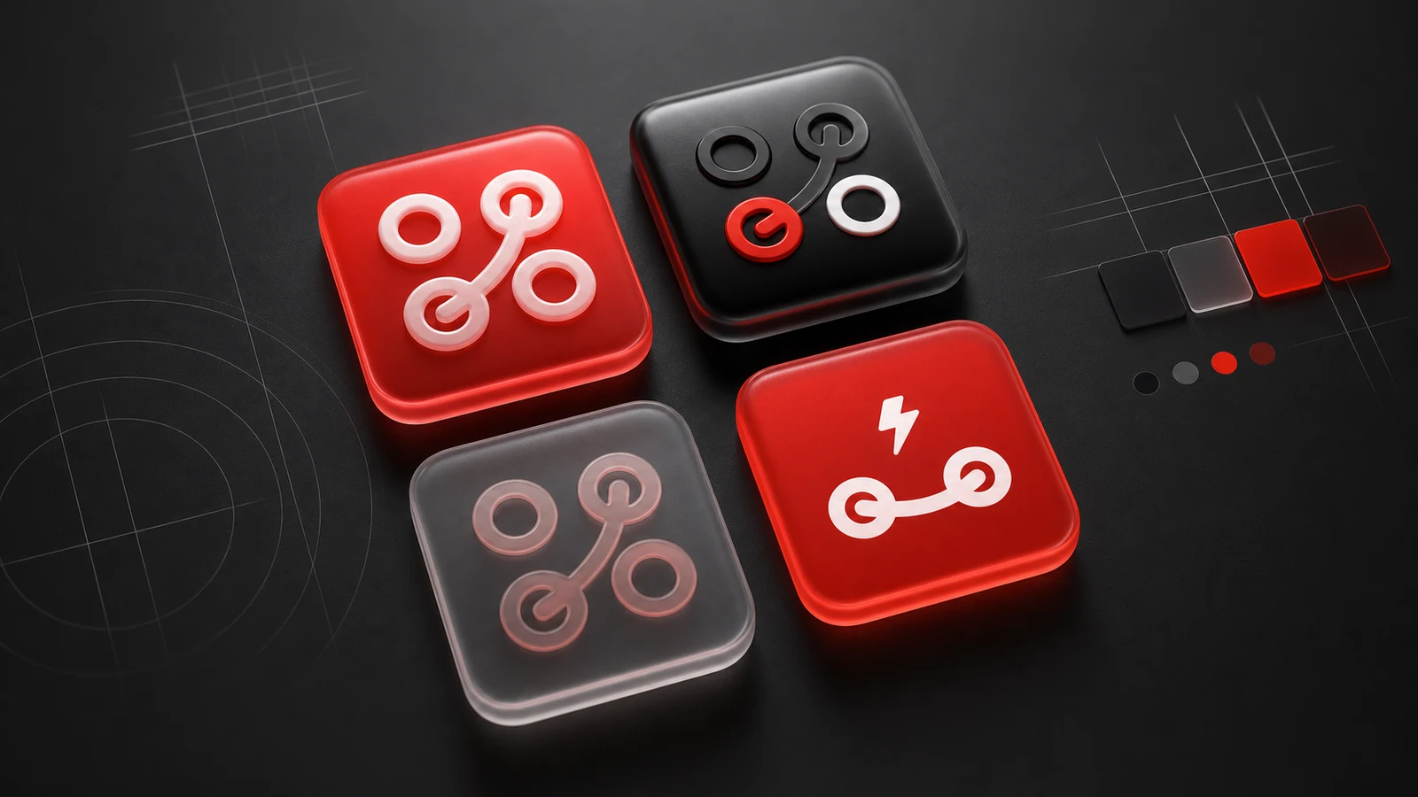
PingRoom now uses Pingroom.icon. PingRoom Agents uses Pingroom-Agents.icon. Each bundle keeps the vector layer, fill treatments, depth, translucency, shadow, and appearance specializations together. Light, dark, and tinted are no longer three unrelated files. They are views of the same object.
PNG assets still exist where Android, the web, splash screens, previews, and older surfaces need them. The difference is that they are outputs of the identity rather than the identity itself.
Giving Agents A Mark Of Their Own
PingRoom Agents needed more than a recolored PingRoom icon.
Its mark uses two connected endpoints and a lightning strike. The connection keeps it related to rooms and handoffs. The bolt gives it a different job: something has happened, an agent needs attention, or a decision has reached a human.
We carried that mark through the native app icon, Android adaptive and monochrome assets, splash treatment, and the app itself. The in-product version is animated with PingroomAgent.json, but it respects reduced motion and settles into a clear static frame. The motion supports the identity; the identity does not depend on motion to make sense.
That distinction matters. The two apps should feel related in a folder, immediately different in a notification, and unmistakable when opened.
How We Shipped It
The hardest part of a rebrand is rarely drawing the mark. It is finding every place the old one can survive.
We treated the rollout as a coordinated product change:
- Built the primary marks as reusable vector sources and Icon Composer bundles.
- Re-exported platform assets for Android, web, splash screens, manifests, favicons, and social sharing.
- Updated the canonical red in UI tokens and SVG libraries instead of patching only the visible screens.
- Added asset validation so a missing
.iconmanifest, layer image, or invalid platform export fails early. - Kept the PingRoom Agents Lottie animation connected to the same static mark and added a reduced-motion path.
- Rolled the assets through the mobile apps, landing site, backend surfaces, and admin panel as one release family.
This is less glamorous than choosing a gradient, but it is what turns a redesign into a durable brand system.
What Did Not Change
The promise is still the same: one tap, everyone knows.
The rebrand does not make PingRoom louder everywhere. Most of the product still stays restrained so the signal can carry meaning. Red remains the strike, not the wallpaper. Motion still needs a reason. The app still prioritizes clarity over spectacle.
What changed is the confidence and consistency of that signal. PingRoom now has an identity that can move from a tiny tinted icon to a full campaign image without becoming a different brand along the way.
This is not a new costume for PingRoom. It is a better instrument for the same idea.

Mahdi Salmanzade
The Ping that cuts through.