The Strike Design System
The design system behind PingRoom: restrained surfaces, one signal color, and a visual language built around impact.
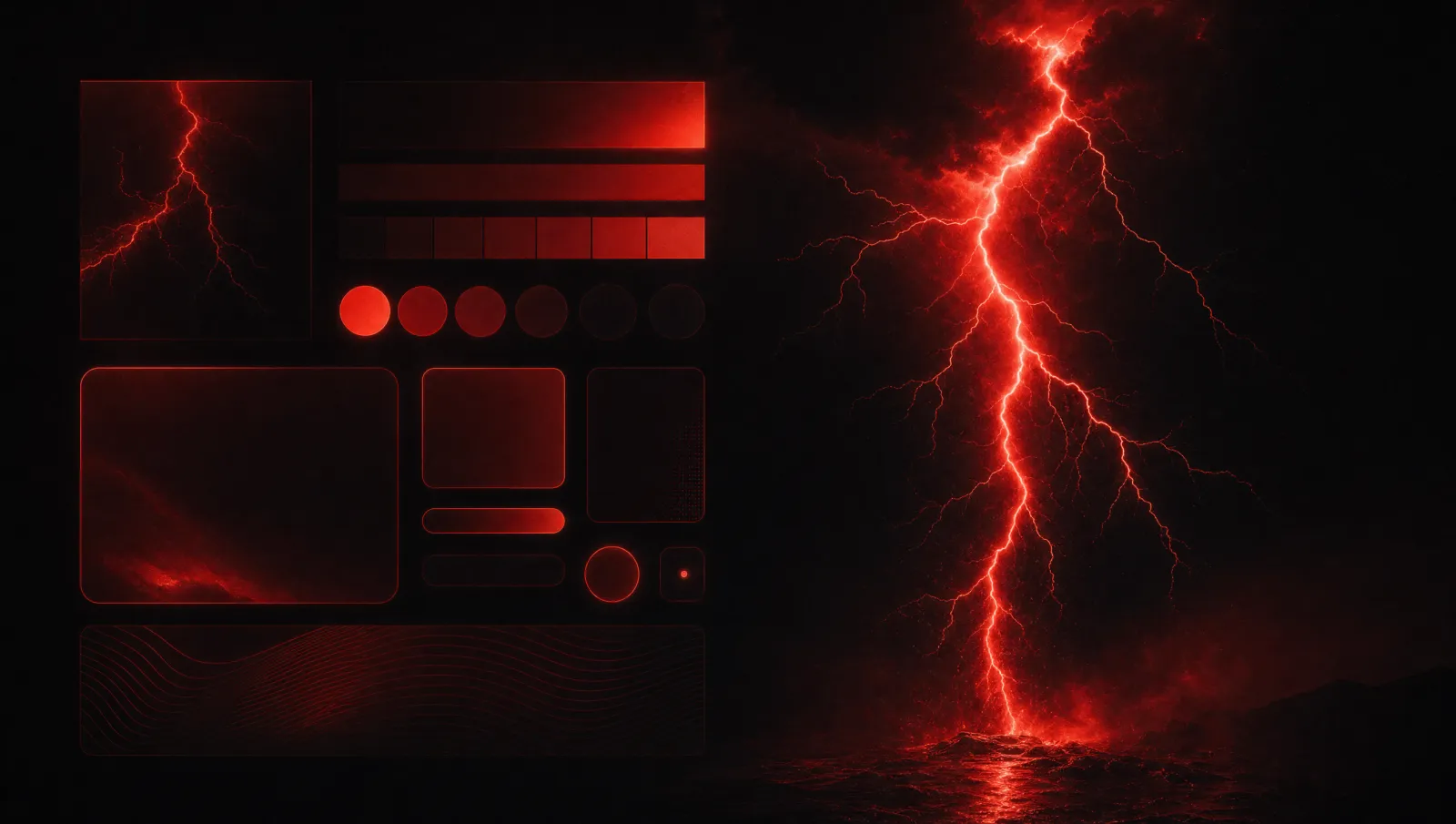
PingRoom's design system is built around one idea: the strike.
The interface should feel like the silence before a bell rings. Most of the surface stays restrained, dark, and composed. Then the signal hits. Red, sound, motion, haptics, and the room action all work together to make that moment feel intentional.
That is the difference between bold and noisy.
One Signal Color
Signal Red is the main accent because the product needs one clear visual strike.
If every card, icon, chart, and glow is red, then nothing is red. The color loses meaning. That is why the system has a "one strike" discipline. Red should mark primary actions, live states, active indicators, and the moments where the product needs to draw attention.
Pro Gold has a separate job. It marks paid-tier surfaces. It should not become decoration. If gold appears everywhere, it stops meaning Pro.
The rest of the palette is mostly neutral: off-switch black, deep charcoal, raised charcoal, hairline borders, bell white, dim text, and paper surfaces for light mode. The neutral world exists so the signal can be recognized.
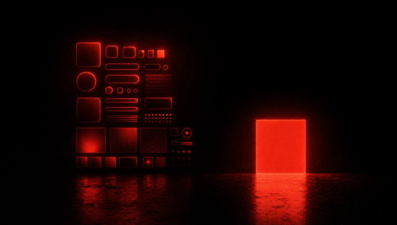
Dark Mode For Contrast, Not Vibes
PingRoom uses dark surfaces because they serve the product.
Dark is not there to look futuristic, cyberpunk, or trendy. It creates contrast for the strike. It lets the red feel like a real signal. It gives the product a cinematic marketing surface while keeping the mobile app precise and usable.
That distinction matters. The landing page can dramatize the bell. The app has to work one-handed, under pressure, and with platform expectations. Both can be bold, but they should not behave the same way.
Motion Has Meaning
Motion in PingRoom should not be ambient decoration.
The glow pulses because the bell rings. A button flourish confirms a send. A widget updates because a Ping landed. A room cell can breathe because it has activity. If motion does not carry signal, it should probably be removed.
That also means reduced-motion support is not optional. The static version still has to feel designed. Accessibility should preserve hierarchy, not flatten the product.
Avoiding The Wrong Categories
PingRoom should not look like a generic SaaS dashboard.
It should not borrow the blue-purple developer-platform look of push notification tools. It should not become childish with stickers and overdone emoji. It should not drift into neon crypto styling. The product can be expressive without losing maturity.
The category is consumer signal with infrastructure underneath. The design has to communicate that unusual mix.
Design As Strategy
The design system is not just visual polish. It protects the product strategy.
A restrained system keeps the app from becoming noisy. A strong strike makes the core action memorable. Platform-aware mobile screens keep the product usable. A dramatic landing page helps people feel the promise before they install.
PingRoom is the bell that cuts through. The design has to believe that before the user does.
How This Guides Product Screens
The design system should make decisions easier for engineers too. A destructive state should not borrow the same meaning as Signal Red. Pro Gold should not become a random highlight. A dense settings screen should not use hero-scale type. A room action should be the visual focus, not one more decorated object.
That makes the design system operational. It is a set of rules that keeps future surfaces aligned when the product adds agents, questions, directories, and more integrations.

Mahdi Salmanzade
Short-form communication.