Drama On The Landing, Precision In The App
Why PingRoom's marketing surface and product surface need different kinds of boldness.
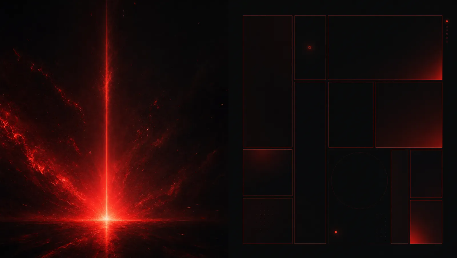
The landing page and the app do not have the same job.
The landing page has to make someone feel the idea quickly. It can be cinematic. It can use scale, glow, motion, strong typography, and a bigger sense of atmosphere. It has to dramatize the moment of the Ping.
The app has to help someone act.
That means the app needs precision. It needs platform conventions, thumb reach, readable settings, fast room actions, predictable modals, and accessibility. It can still be bold, but it cannot be theatrical at the expense of use.
The Marketing Surface
PingRoom's marketing surface exists to make the product promise obvious.
The visitor should understand that this is not a generic notification tool. It is not a B2B push platform. It is not a chat app. It is a room-based bell for people, teams, and eventually agents.
The visual language can be larger than life because the landing page is a stage. Display typography can hit hard. Red glow can suggest the strike. Motion can carry the bell metaphor. Copy can be short and declarative.
But even the drama has to stay disciplined. No fake dashboards. No stock startup scenes. No trust-badge clutter. No gradient text trying to sound important. The product should feel confident enough to be direct.

The Product Surface
Inside the app, drama becomes ergonomics.
A user might open PingRoom while walking, cooking, managing a delivery, responding to an incident, or checking a room from a watch. The interface should not ask for attention in the same way the marketing page does. It should give control quickly.
That is why the room action grid, settings rows, trigger screens, modals, and history cells need calm structure. The app can use strong color and sound, but only where the signal needs it. Most of the screen should help the action stand out.
Shared DNA
The landing and app still need to feel like one product.
They share the same core palette, the same signal red, the same belief in bold typography, the same room language, and the same refusal to look like a generic SaaS template. The difference is in volume.
Marketing says: feel this.
Product says: do this.
Why This Matters
A lot of products fail because every surface speaks with the same voice.
If the app behaves like a landing page, it becomes exhausting. If the landing page behaves like a settings screen, nobody feels the promise. PingRoom needs both forms of boldness: emotional impact before install, operational clarity after install.
This is one of the design principles I want to keep protecting as PingRoom grows. The product can become more capable, but each surface should remember its job. Drama where it sells the signal. Precision where the user sends it.
The Same Rule Applies To Agents
Agent features need this split too. The landing page can tell the big story: agents and humans sharing one notification fabric. The app and docs have to be precise: scopes, rooms, approval states, structured data limits, and revocation paths.
That is how PingRoom can speak to builders without becoming a developer-dashboard brand. The story can be ambitious, but the surfaces where people act have to stay clear and practical.

Mahdi Salmanzade
Short-form communication.